True Liquid Layout
In today’s world of web design, making websites work well on all devices—like phones, tablets, or computers—is super important. Two main ways to do this are Traditional Responsive Layout and a newer idea called True Liquid Layout. Both try to make websites look good on any screen, but they do it differently. Let’s look at what makes them special and why True Liquid Layout is becoming popular as a smart, modern choice.
What is Traditional Responsive Layout?
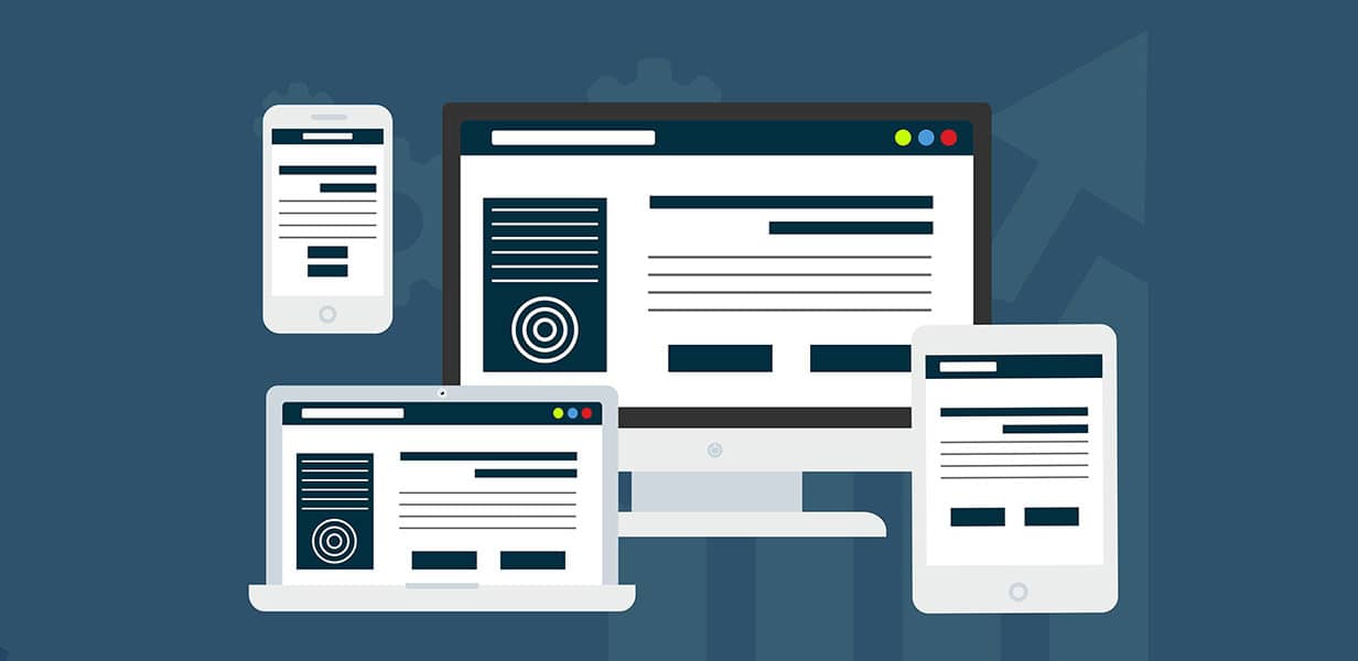
Traditional Responsive Layout is a popular way to make websites work on all devices. It started in 2010 by Ethan Marcotte and has been used for over ten years. This method uses flexible grids, special rules called media queries, and units that adjust to fit different screen sizes. The idea is simple: make a website look good and work well on both computers and phones.

Here’s how it works. Designers set specific points—called breakpoints—like 1024px for computers, 768px for tablets, and 320px for phones. At these points, the layout changes to match the screen. For example, a website might show three columns on a computer, two on a tablet, and one on a phone. CSS media queries help switch the styles based on the screen size. This way has made websites easier to use on all devices.
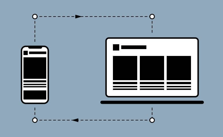
But it’s not perfect. Breakpoints are fixed and based on common screen sizes from when the site was made. When new devices with different sizes come out, these fixed points don’t always work well. This can make layouts look strange or need extra updates to stay good.
The Birth of True Liquid Layout
True Liquid Layout takes responsive design further and makes it more flexible. It was created in 2014 by Tuan Thanh Ngo from the HTMLCODING Team. They were working for some Japanese customers who wanted designs to look exactly right on every device. Traditional responsive design, with its fixed breakpoints, couldn’t do this well. So, he came up with a new idea: a layout that adjusts smoothly to any screen.

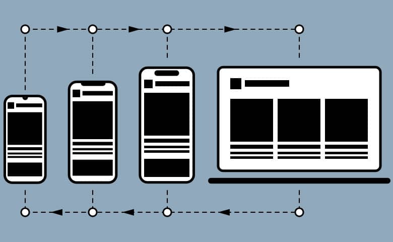
True Liquid Layout uses percentages instead of set breakpoints. This means the design doesn’t jump at specific widths—it grows or shrinks to fit any screen size perfectly. It uses tools like %, vw, vh, and a CSS trick called calc() to make everything look consistent. The result is a "liquid" design that flows and stays true to the original idea, no matter the device.
Key Differences
Imagine a webpage where every element, images, and text—changes smoothly when you resize the browser. It doesn’t use strict sizes to decide how to adjust. Below is a demo of this. Try dragging the right edge of each browser to see how it works.
お金の管理も
かんたんに
アプリへのリアルタイムな履歴反映や自動カテゴリー分類で、お金の管理もかんたんに。
Traditional Responsive Layout
お金の管理も
かんたんに
アプリへのリアルタイムな履歴反映や自動カテゴリー分類で、お金の管理もかんたんに。
True Liquid Layout
- Flexibility and Scalability
- Responsive Layout: Uses fixed points (breakpoints) to change the design. This can make it hard to fit new or unusual screen sizes and might need updates often.
- True Liquid Layout: Adjusts to any screen size using percentages. It doesn’t need extra fixes for different devices.
- Granularity of Control
- Responsive Layout: Changes the layout at set points. Sometimes, this makes the design jump or look odd between those points.
- True Liquid Layout: Adjusts little by little, so it looks smooth and nice on all screen sizes.
- User Experience
- Responsive Layout: Works great for common devices but might struggle with rare ones, like super-wide screens or foldable phones.
- True Liquid Layout: Feels ready for the future. It fits new or unusual screens without extra work.
Why True Liquid Layout Matters
Today, more devices use the web—like smartwatches and foldable phones. Fixed breakpoints in traditional design can’t always keep up with these changes. True Liquid Layout offers a smart solution. It fits the web’s natural ability to adjust and works well not just for now, but for new tech in the future too.
Plus, it can make websites faster and easier to use. It doesn’t need lots of complicated rules or extra CSS, so pages load quicker. For users, everything stays clear and simple to read, no matter what screen they’re on.
Challenges and Considerations
True Liquid Layout isn’t perfect, though. Using percentages means you have to plan carefully. If not, things might look too squished or too stretched. On the other hand, traditional responsive design is easier to understand. Its breakpoint system is simple and predictable, especially for designers used to working with common devices. True Liquid Layout asks you to think differently—about smooth changes instead of set points.
Conclusion
Both Traditional Responsive Layout and True Liquid Layout try to solve the same problem: making websites work well on all devices. But they do it in different ways. Traditional Responsive Layout is good for designers who want something fast and easy. It uses set points and doesn’t worry too much about matching the design exactly. True Liquid Layout is stricter—it keeps the design perfect on every screen size, using percentages. It’s great for projects with lots of details.
Which one is right for you? It depends on what you need. Traditional Responsive Layout is simple and quick. True Liquid Layout is best for detailed designs that must look the same everywhere. As screens keep changing, True Liquid Layout feels like a fresh, exciting way to make websites fit any size.

